It is stylish that home or property owners seek the improving of their home to be sold or rented quicker. Sometimes with a few improvements and enhancements, the overall appearance changes a lot and achieves an impact that will be immediately reflected and visible in the sale price. If you are thinking of a small renovation of your home, a new coat of color remains one of the most economical and cheap ways to make a change. We will show you some wall paint color that will trend in for year 2021
You must choose colors capable of pleasing the greatest look and feel to the viewers, therefore the wall color should be simple and classic, playing with the shades of the same tone through the different spaces. That way you ensure a good first impression feelings and a suitable backdrop for any idea of furniture or decoration and trimming that the potential buyer brings in mind when visiting the home.
The ideal recommended colors are:
- Khaki, combined with pure whites
- Medium shades of blue
- Bone color, toasted sand and black.
From Neutral to Khaki, Jaipur pink to navy blue, experts forecast that shades that reflect nature will bring respite, but that maximum will return
Forecasters are already looking to next year to decide which colors and trends will take off in 2021. The design decisions of next year will inevitably and certainly be impacted by life in 2020, and so experts are already predicting and foreseeing that we will seek out descriptions that offer break. .jpg)
While Pantone has yet to declare a shade of the year, some companies has already released its color forecast for 2021. This is an insight into the color choices it believes people will make in the coming year.
There are more that 40 key shades, which you can see in full in the gallery above. The colors are split into four groups of 10: Sanctuary, Tapestry, Continuum and Encounter.
Sanctuary
The first set of colors is called Sanctuary, reflecting the peace, stillness and calm that people will be inclined towards after a difficult 2020. Palette is guided by the principle of biophilia – bringing nature inside the home.
These are the colors that encourage us to take pause, that respite is the special role our spaces can symbolize, helping us slow down and embrace what’s truly important.
The undeniably earthy colors take inspiration from nature and Scandinavian design and encourage a warm simplicity.
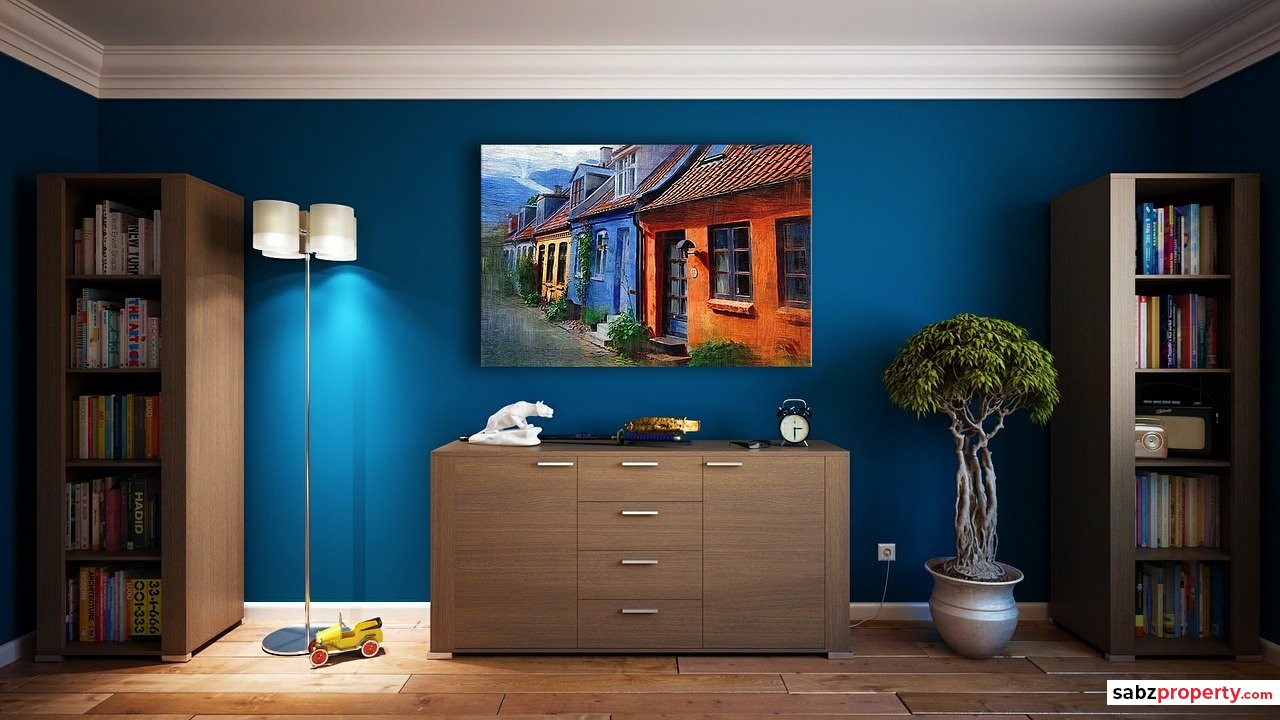
Whether you are saying goodbye to your old house or hello to a new one, this classic color palette is suitable for all areas and is a good option, especially for living rooms, kitchens and spaces where family life takes place.
When choosing the colors to paint the house, light colors are usually used to paint the openings, the moldings, the baseboards or the floor and the boldest colors are chosen for the walls.
Encounter
Continuing in the vein of Earth-inspired shades is the Encounter palette.
This set of 10 colors that provides a subtle reminder that beauty often has humble beginnings and set of inspired look and feel.
Continuum
The Continuum set brings vibrancy, an indication that 2021 may not be exclusively about hunkering down and being at one with the Earth. It is described as an engineered environment. 
According to the color trend experts, Mid-century modernists set an exhilarating new standard with sculptural architecture and bright, forward-thinking insignia. Technology ties into so much of what we see, but we want it to blend seamlessly into the whites, charcoals and pops of colors in our environment.
Tapestry
Creative expression – a top influence for the Tapestry palette – is all about personality, genuineness and authenticity, it is warm palette, with pinks and yellows shining through. Bringing back joy is an important part of the Tapestry palette,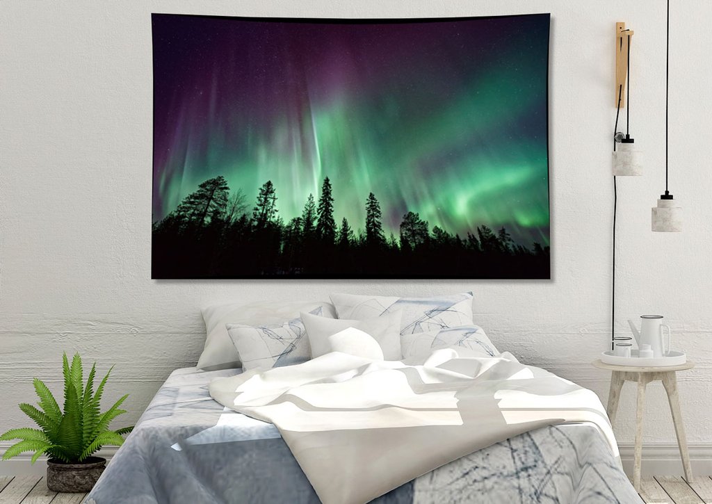
The jewel tones in the collection connect the pursuit of happiness with a desire for the lavish. The 10 colors have been inspired by security, creative expression, classics revisited and sensory exploration". Demonstrating how the colors will work in domestic spaces, beside these 10 types and 40 key shades, there is a lot more to go
Trendy Warm paint colors for walls
The colors of the families of red, orange and yellow are known as warm colors, since they are colors evoke images associated with heat, such as fire or sun.
As a result, they make us feel warm in a emotional sense and a relaxing environment.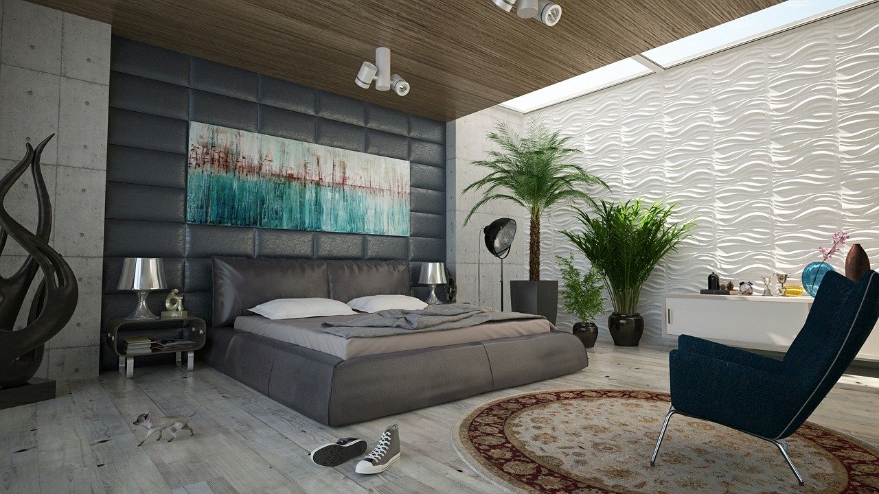
Yellow Wall
Yellow is a primary color and is also classified within warm colors. It is a color that attracts attention and attracts the eye like no other, that is why it is widely used in traffic signs, for example. It is the brightest color of the color spectrum so it is ideal for dimly lit areas such as hallways and hallways. The most vivid tones are those that have more red in their composition such as egg yolk yellow, it is recommended not to use them in large quantities but to accentuate other tones, such as in a pattern or wallpaper. Be careful with yellows that are too citrus, they can be cold, because they lack red in their composition.
Orange Wall
The color orange can be very bold and it is better to use it to accentuate instead of painting an entire wall. It is an exciting color and affects us by increasing enthusiasm and driving action. The peach color or in its terracotta tones is used for rustic environments..jpg)
Pink Wall
Pink is a lustful and pleasant color. Classified within the range of warm colors, it offers innumerable possibilities, as it can be an exciting color or on the contrary a color that invites you to relax depending on the chosen hue. We will see some examples of decoration in pink.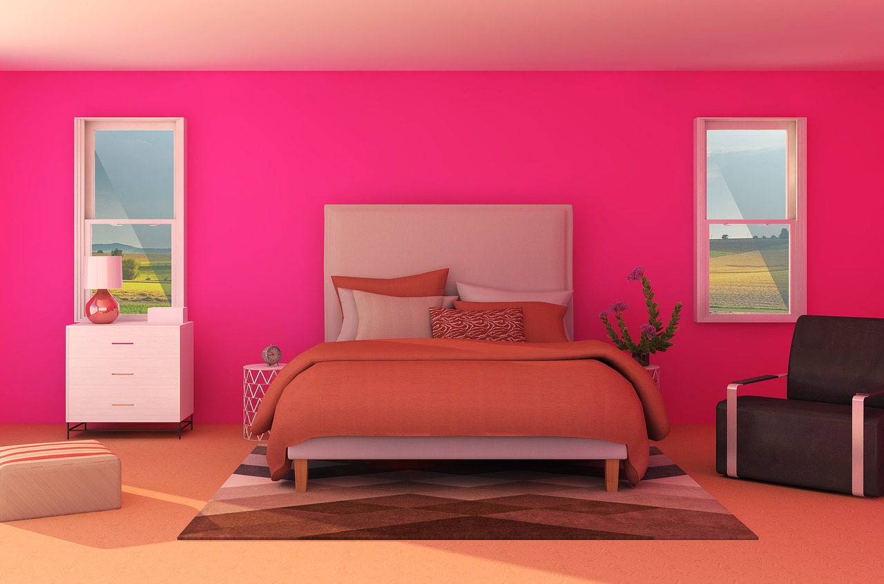
Decorating a house with white walls can be an excellent idea, if you know how to do it with good taste. We show you below, a few inspiring ideas.
The white color seems to be the one that dominates completely in this house that recreates the old Swedish country style.
You can play with textures or prints in their different shades or with other tones that are harmonic.
For more, keep connected and updated with www.SabzProperty.com


LEAVE A REPLY
Your email address will not be published. Required fields are marked *